

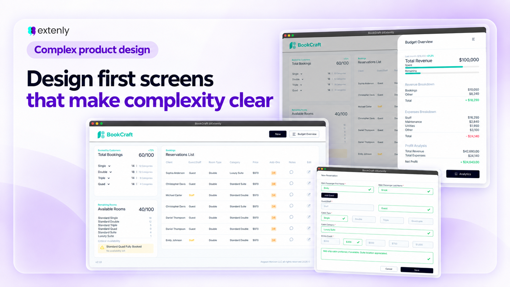

Many complex tools fail because the first screen either shows too little or far too much.
If it shows too little, users have to search, click, and dig before they understand what is happening. If it shows too much, the interface becomes noisy, stressful, and hard to trust.
This is especially important in complex products like dashboards, internal tools, desktop applications, tablet interfaces, automotive systems, and operational software. These products often deal with large amounts of data, multiple user roles, and decisions that need to be made quickly and accurately.
At Extenly, our design approach is not to simplify by hiding complexity. Instead, we structure complexity so the user can understand it.
The first screen should answer a few essential questions:
- What is the current situation?
- What needs attention?
- What can I do next?
- Where can I go deeper if needed?
The Booking Management Tool: Designing the Overview
Our recent booking management tool project is a good example of this challenge.
The interface needed to support a lot of information at once: reservations, room availability, guest details, booking status, add-ons, notes, dates, payments, and operational actions. If everything was shown with the same visual weight, the screen would quickly become difficult to read. But if too much was hidden, the team would lose the overview they needed to work efficiently.
The design challenge was not simply deciding what to display. It was deciding what the user needed to understand first.
For this kind of tool, the overview needed to help the team answer practical questions immediately:
- How many bookings are active?
- How many rooms are still available?
- Which room categories are filling up?
- Which reservations need attention?
- Where is more detailed information available if needed?
That meant the interface needed to create a clear hierarchy between summary and detail.
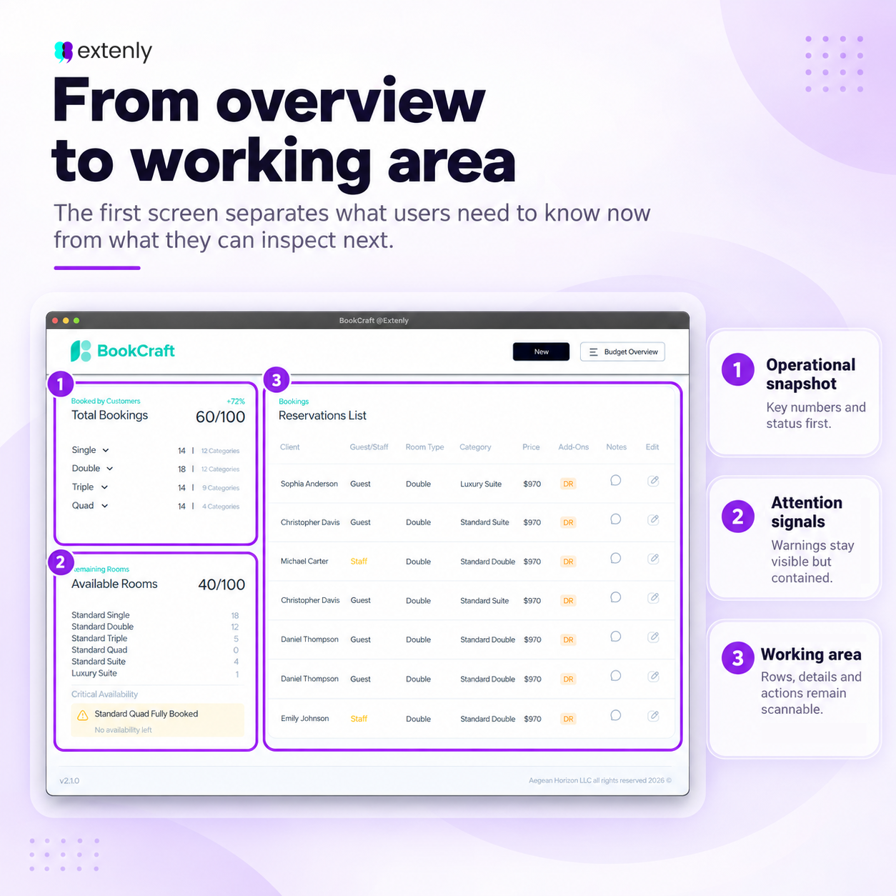
In the BookCraft design, the left area was used as an operational snapshot. It gave users the key numbers first: total bookings, remaining rooms, and availability by room type. This allowed the team to understand the current situation without opening individual reservations one by one.
Next to that, the reservation list became the working area. It kept detailed booking information accessible, but structured it in a way that supported scanning: guest name, role, room type, dates, amount, add-ons, notes, and edit actions. The goal was not to make the table decorative. The goal was to make it usable during real operational work.
This is where small design decisions matter: spacing, column order, labels, status indicators, and visual contrast all help users move through information without feeling lost.
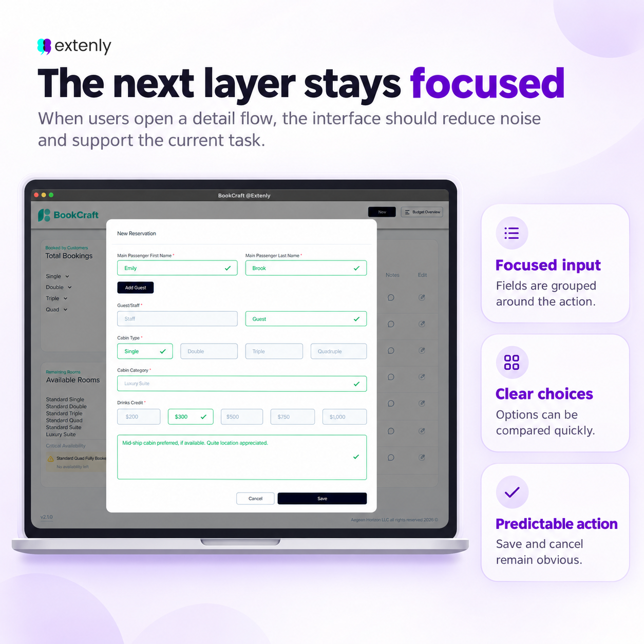
The same principle applies to many other products. A dashboard should not become a wall of charts. An internal tool should not force users through unnecessary screens. A tablet interface should make key actions clear in context. An automotive UI should surface only what matters at the right moment.
Good complex product design is about hierarchy, timing, and clarity.
Users should not have to fight the interface to understand their work. The product should help them scan, decide, and act with confidence.
That is how we approach complex UI/UX design: not by making products look simpler than they are, but by making complexity easier to work with.