

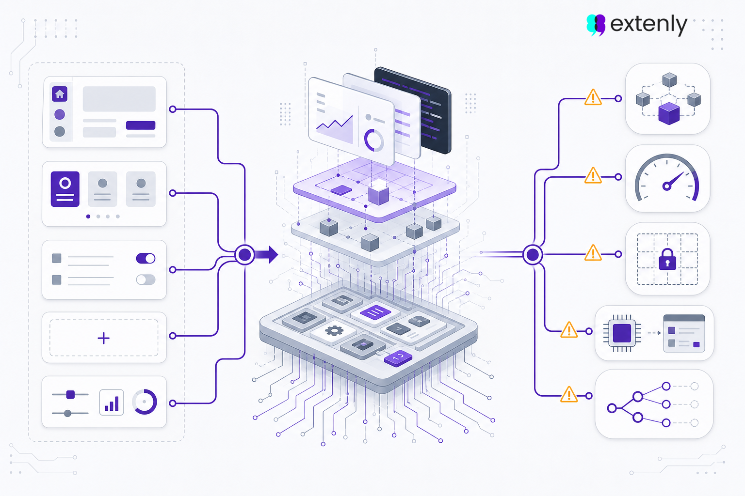

Embedded UIs are often judged by what users see first: the screens, the layout, the graphics, and the overall visual quality.
But in real products, a good embedded UI is not only about how it looks. It also has to run reliably on the target hardware, respond clearly to user input, handle different system states, and stay maintainable as the product evolves.
Many UI problems do not appear immediately in the first design or prototype. They show up later, during implementation, hardware testing, customer demos, or real-world use.
Here are five common embedded UI mistakes that can create problems later in a project.
- Missing real UI states
Many interfaces are first designed around the ideal situation: the device is ready, the data is available, the connection works, and the user can move through the interface without interruption.
But real products rarely behave like that all the time.
An embedded UI also needs to handle states such as loading, empty content, no connection, disabled controls, unavailable sensors, device busy states, permission restrictions, errors, interrupted processes, and long-running operations.
If these states are not considered early, they often get added later as quick fixes. This can lead to inconsistent screens, unclear feedback, duplicated logic, or confusing behavior for the user.
For embedded products, this matters because the UI is often connected to hardware, system processes, sensors, network conditions, or real-time operations. The interface needs to clearly communicate what the product is doing, what the user can do next, and what is temporarily unavailable.
A reliable UI is not only designed for the perfect flow. It is designed for the moments when the product is waiting, busy, unavailable, restricted, or recovering.
- Using animations and effects without hardware awareness
Animations, transitions, shadows, blur effects, and other visual details can make an interface feel more polished.
But on embedded hardware, every visual effect has a cost.
An animation that looks smooth in a design tool or desktop prototype may behave very differently on the actual device. Limited CPU, GPU, memory, display resolution, or rendering capabilities can quickly turn a nice effect into slow transitions, dropped frames, or inconsistent behavior.
This does not mean embedded UIs should avoid animation completely. Motion can be useful when it supports orientation, feedback, or clarity. But effects should be chosen with the target hardware in mind.
The question should not only be: “Does this look good?”
It should also be: “Can this run reliably on the product?”
- Treating images and graphics like web assets
Another common mistake is using images and graphics without considering the constraints of the embedded environment.
Large image files, unnecessary transparency, heavy gradients, oversized icons, complex SVGs, and multiple high-resolution assets can all affect performance and memory usage.
This is especially important when the UI needs to start quickly, switch screens smoothly, or run for long periods without instability.
Graphics should be prepared for the actual product, not only for visual approval. That means using appropriate sizes, formats, compression, and asset strategies.
A small optimization at the graphics level can make a noticeable difference in startup time, memory usage, and overall responsiveness.
- Assuming touch and physical controls work like desktop input
Embedded devices are often used in very different conditions from desktop software.
Users may be standing, wearing gloves, working under time pressure, operating machinery, or using the product in bright, dark, noisy, or physically demanding environments.
That makes touch interaction especially important.
Small buttons, weak feedback, unclear disabled states, hover-based thinking, and dense layouts can all create usability problems. What feels acceptable with a mouse can become frustrating or unreliable on a touchscreen.
In many embedded products, touch is also not the only input method. Interfaces may need to work together with hard keys, rotary controls, function buttons, or directional navigation. This creates another layer of design complexity: focus states, selection behavior, shortcuts, confirmations, and input feedback need to be designed intentionally. A UI that works well by touch may still feel awkward or unclear when operated through physical controls.
Good embedded UI design needs to consider real interaction conditions. Touch targets should be clear, feedback should be immediate, and important actions should be easy to understand and confirm.
The goal is not only to make the interface look clean. It needs to be usable in the environment where the product actually operates.
- Loading too much at startup
Startup performance has a big impact on how users perceive a device.
If an embedded UI loads every screen, image, animation, data set, and component immediately, the product can feel slow before the user even starts using it.
This is a common problem when the UI grows over time. More screens are added, more assets are included, and more logic is initialized at startup. Eventually, the first experience becomes heavier than necessary.
A better approach is to keep startup lean.
Critical elements should be ready quickly. Non-critical screens, assets, and data can often be loaded later, initialized when needed, or prepared in the background.
This helps the product feel more responsive and avoids making users wait for things they may not even use during that session.
Test early on the real hardware
Many embedded UI issues are difficult to judge from a design file or desktop prototype.
Performance problems, slow startup, unclear touch feedback, oversized graphics, dropped frames, and awkward transitions often become visible only on the actual device.
That is why testing should not wait until the UI is visually complete.
Early testing on target hardware helps teams catch problems while they are still manageable. It also creates better decisions around graphics, interaction, performance, and implementation.
In embedded UI development, the interface is part of the product experience. It needs to look good, but it also needs to behave reliably under real conditions.
The earlier these details are considered, the easier it is to build an interface that feels polished, responsive, and ready for real use.